
I’ve had a couple people forward me what’s hitting mailboxes across the state this week. And among our first entries in the general election are a couple of non-Republican candidates.
What else do they have in common? Both of their cards leave a lot to be desired.
First off is a card from District 13 Candidate Norman Bliss. Can you tell what’s wrong with it?
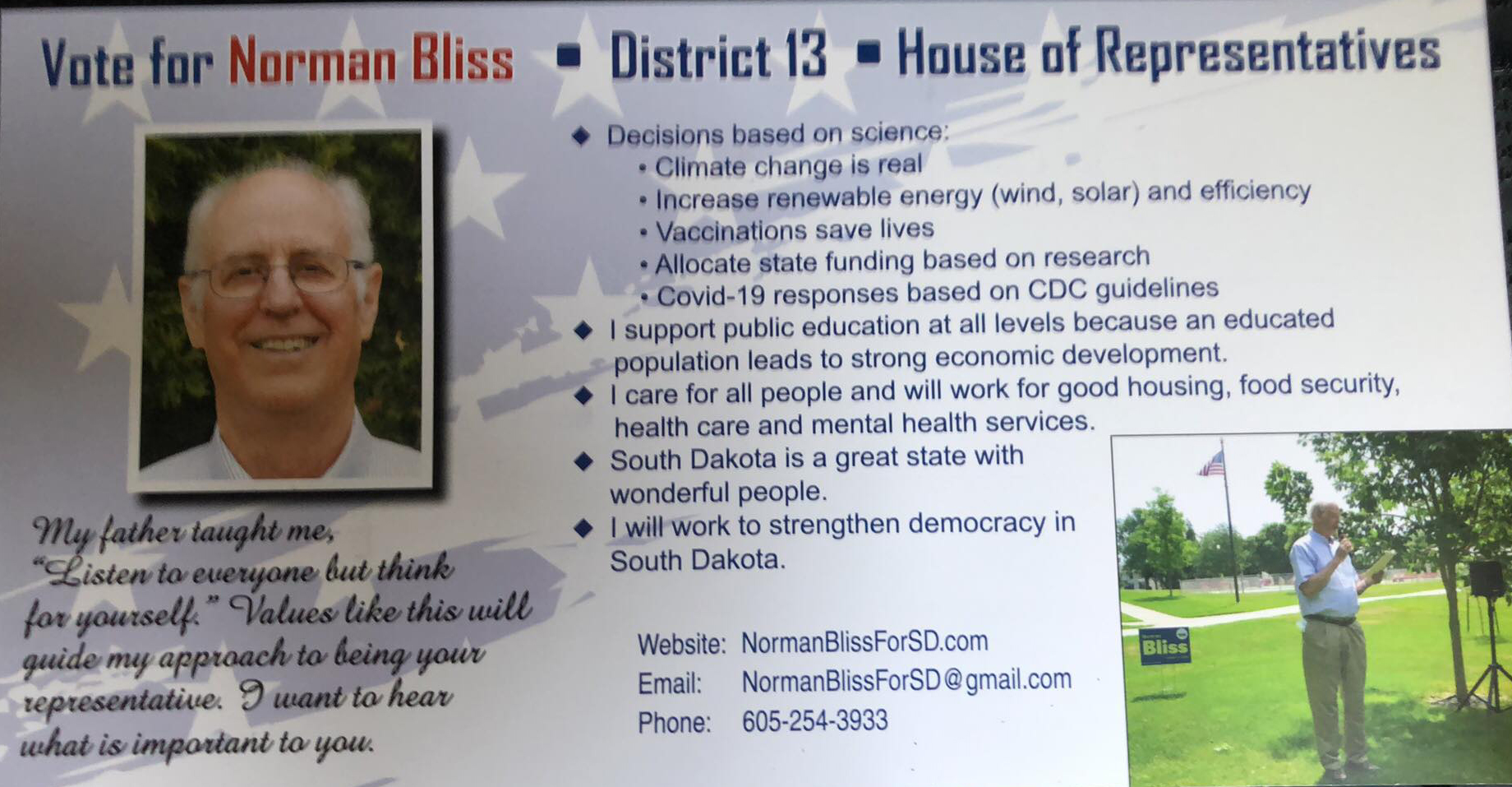
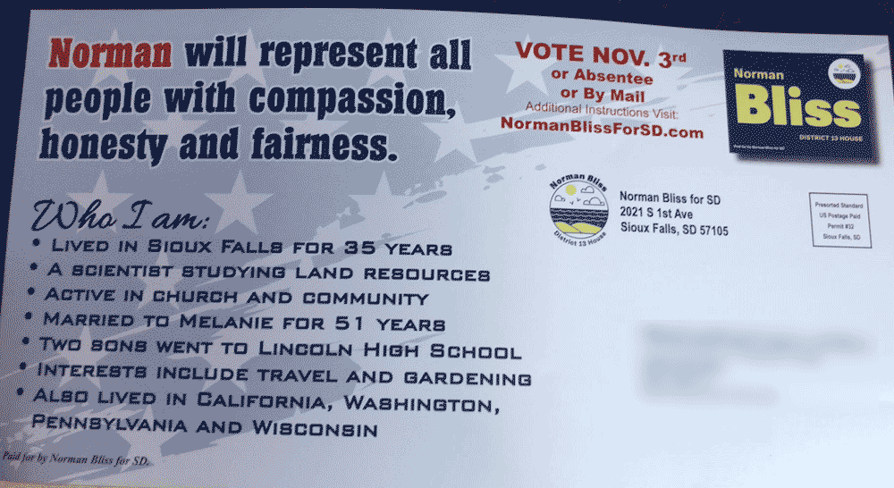
As I’m known to remark to my designer and others “Words words words words…” Good gosh. As it travels between the mailbox and the trash, no one is going to read all of that. The mail panel side isn’t bad, but we go from 7 bullets on that side to huge blocks of text on the other. I know I’m accused at times of being verbose, but this was too much. When it comes to mail pieces like this, less is sometimes more.
On the front we pair a fair head and shoulders shot with a long distance picture of the dude holding a notebook.. because people want to know he can read from a notebook. But let’s make it weirder, and just shove it off to the side. I mean, it has elements that could be ok if they arranged them a little better, but they’re trying to jam too much in, and then shoving the logo, one of the important parts (because it’s the basis for the candidate’s branding) off to the corner.
Speaking of branding.. We have 2 logos going, and one of them (in the address block) is inserted as a logo within a logo in the top corner. I can only ask.. Why?
This card went to a Republican from the Democrat candidate, so he spent some money to hit far and wide with this badly done piece.
From District 13 in Sioux Falls, we zip out west to District 35 Independent Brian Gentry as he blasts this mail piece from Ohio to Rapid City:
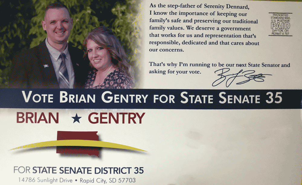
First off, coming from the same minds that brought us Kevin Quick’s awful material in the primary, once you see it – you can never unsee it. With that weirdly non-centered lettering up top, and the slash in front of South Dakota, what does that logo resemble?
![]()
![]()
It’s a frowny face logo. His entire campaign branding is based on an emoticon.
But that’s only the start. Most aren’t going to catch that spelling error in stepfather (unlike others we’ve seen), and I probably would have missed it if this next error didn’t just jump out and grab me….
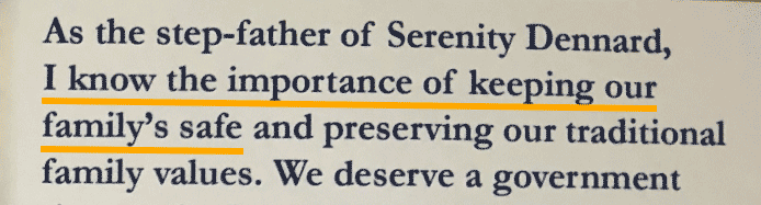
He knows “the importance of keeping our family’s safe..” Um.. Because that’s where we put important papers? That misuse of “family’s” versus “families” kind of changes the meaning a bit.
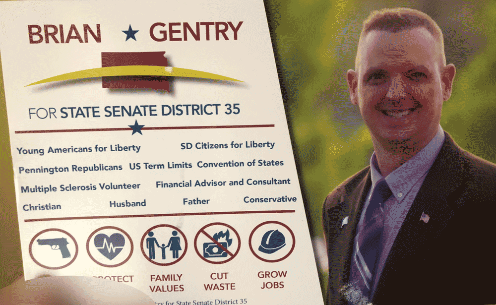
Then we go to the frowny logo on the front, paired with a darkly lit head and shoulders shot, and a word soup of pretending to be more Republican than anyone.. except omitting the part about not being the Republican in the race.
It’s basically yet another cookie cutter piece like we saw used in the primary, and hardly worth the money that Gentry paid for it.
And the campaign keep rolling on!
(Get a card in the mail? Send me a copy and keep those cards rolling in!)
Branding challenged. Love the dark photo of the guy looking like a villain from a batman movie. Mwahaha.
Love the branding analysis.
Trump is masterful at branding.
I like to think I can do it in a pinch. 😉
wow. since serving in the legislature is a demanding part-time job with very low compensation, some voters might be interested in knowing what they do for a living, or how they pay their bills. Why don’t they tell us what they do for a living and whom they work for?
As for Brian Gentry, claiming to be one of the adults who utterly failed Serenity Dennard is not something to brag about. The more we learned about that family the worse they looked: the child had been separated from every adult she had ever formed an attachment to. While her stepfather might have entered the picture after her adoptive mother lost contact with her, and it’s possible he never even met the child, this association is nothing to write home about, nor put on a postcard and send out to voters.
Is Bliss one of those putting up those billboards at the corner of 41st and Minnesota in Sioux Falls? He sounds like an old socialist who thinks he knows better than everyone else because he is a SCIENTIST. He’s using all the far-left buzzwords and phrases like “climate change” and “food security”. He seems to support college for all which is another socialist means of indoctrinating people. A big no on Nahmie!
Is it just me or does the photo of Gentry by himself look like Jeopardy star Ken Jennings with a crew cut? Kinda like Joe Biden reminds me of Jeff Dunham’s buddy, Walter, although Walter is more with it and much less crotchety. Also, the misspelling of “family’s” makes me wonder how competent he is; did he approve this message before it went out? I sympathize with the family on the disappearance of Serenity and pray that she will return, but I don’t know that it is pertinent to his ability to be in public office.
If you want to make a word that ends in “y” plural, “Change the ‘y’ to an ‘i’ and add ‘es’.” That’s what I was taught in 1st or 2nd grade.
Why would they teach about forming plurals when they can teach about:
they, them, their, theirs, themself
sie, hir, hir, hirs, hirself
zie, zir, zir, zirs, zirself
Yeah, why would “they” teach plurals when they can teach a whole other subject on gender roles? Surely nobody ever teaches both, and you’re not conflating anything.
The above was sarcasm. Sorry I used it in kind. I hope in the future you will directly state what you mean.
Surely nobody ever makes typos, and only the smartest people never forget what they’re taught in primary school. Thankfully we have the wisest people like you.
The above was sarcasm. Sorry I used it in kind. I hope in the future you will directly state what you mean.
Norman Bliss is a wonderful, caring and intelligent person who will make great decisions for SD. I think his postcard is thorough and worth a read.