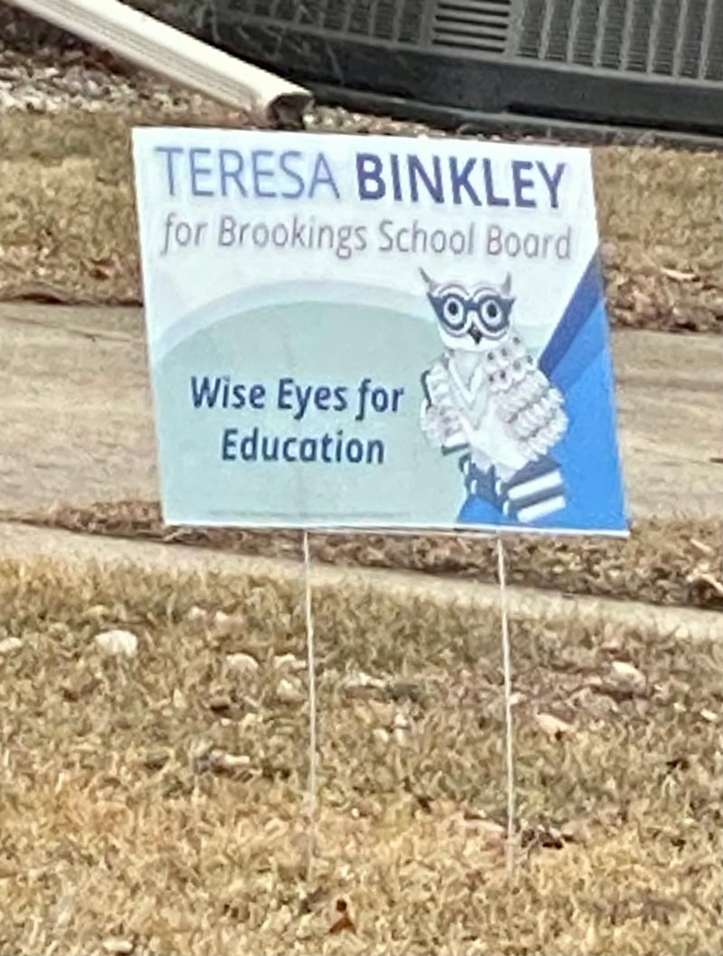
Yard Signs are starting to pop up in my neighborhood for the April Election, and a couple in particular caught my eye as good examples of what NOT to do if you’re designing campaign material. First up is Teresa Binkley for Brookings School Board:

All I can think is that someone must have a thing for owls, because that’s the most significant thing on the sign. Keep in mind you’re reading this after I’ve snapped a photo, blown it up, and enhanced the contrast. Because if you’re driving by at 25 MPH, it’s actually very challenging to read.
It’s supposed to be advertising Binkley for School Board, but the last name is one of the smaller items on the sign, and is relegated to the upper right corner. What’s even more maddening is that they probably have $5-7 or more into the sign which spends more space advertising an owl than the race. There was plenty of room for the name, and Binkley isn’t terrible contrasted for readability.
The candidates name is unfortunately JUST TOO DARN SMALL, and represents wasted money, and a wasted opportunity for the candidate.
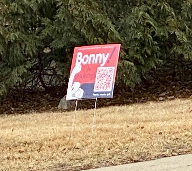
And then there’s this utter mess of a sign:

It appears to be for a candidate named Bonnie, but I got in an accident trying to open the giant QR code on the sign as I drove by, as I stuck my phone out the window and tried to click on it to open the link. Just kidding about the accident. But no one is going to click on a QR code as they’re driving by.
And even enhancing the contrast in the image, it’s more than challenging to see what the sign is. Literally, it’s like the designer’s computer decided to barf random graphics. There’s a lightbulb. An exclamation point. And I think that’s an arm. Is this sign supposed to communicate something?
If you stop, you might be able to make out that it’s “Bonny for Brookings,” but even that’s challenging to make out because there’s so little contrast between the 2 colors.
And we’re only given 1/2 of the information. There’s a Bonny. And she’s for Brookings… Brookings what?
There’s $7 or more down the drain for that sign. Each. Ugh.
A good campaign sign really isn’t difficult to do. But when people decide to be “extra creative” it can quickly turn into a mess.
A good campaign sign communicates basic information on name and office. (The two most important things). Latest trend is for people to emphasize their first name. You’ll see more women than men who do it. If your name is distinctive – Like Dusty in Dusty Johnson – I think you can do it. But I’d tread carefully with that. As in this case, I’m not sure anyone is going to readily identify one “Bonny” from any other Bonny or Bonnie in the community.
A good campaign sign communicates its message in a flash in readily visible and easily readable text which contrasts from the background color. The goal is to communicate a message in 2 seconds or less as someone drives by at 25 mph in town, or 55 mph for a large sign on a highway.
As I opined in Bonny’s case, this sign is more likely to cause an accident than communicate an effective message that she’s running for anything.
Moving on..

To some people owls are harbingers of death.
To others, they are flying monsters that throw-up mouse hair and bones.
And yet others a symbol of knowledge, wisdom, and baby deer tutelage.
Ready thyself for the sign-pocalypse.
I just cannot resist…..Whooooooooooooo gives a hoooooooot????????????????????
Owl I know is what I can read….or izzit what I read at 25mph??
Okay…I yield the balance of my thyme.
Good commentary on the yard signs, as always. Function should always trump artistic creativity.
One intriguing exception to the first name argument: In Virginia, one US Senate race featured Republican John Warner running against Democrat Mark Warner (yes, same last name and spelling!). Signs reading “John, Not Mark” and “Mark, not John” went up all over the state!
Your accident comment made me laugh out loud-twice! 😂
Full transparency, I usually find your articles very biased in favor of establishment politicians aka lifers/career politicians campaigning to keep representing South Dakota, which tends to infuriate me considering you are conservative (I think?!) so we must have different definitions of conservative considering your die hard stance in support of Thune and Dusty despite neither of them voting like they are true conservatives. Regardless, I want to let you know I actually really enjoyed this post and agree with your commentary regarding the signs. I also think the subject matter is valuable and worth writing about.
I hope to meet you one day so I can pick your brain about your choice of politicians to support. If a Republican conservative challenger advertises on your website will this impact your opinion or underlying opinion in your posts? I think you have a good personality and I do find your content worthy of reading and original, which is hard to come by in a world of copy and paste. For what it’s worth, thank you for sharing the ins and outs of all things politics for South Dakota.
Dusty has clearly taken a stand that he doesn’t want the federal government’s role to grow, he has also taken stances to make sure the bureaucracy doesn’t grow. Some “republicans” don’t like it but the truth is he’s keeping government out of our lives. He voted against green new deal, against vaccine mandates, against $6 trillion in spending packages. What pseudo conservatives, like taffy, don’t like is that Dusty doesn’t say that the federal government should take over elections. Taffy wants the federal government to impose new rules on elections, Dusty would never ask for the federal government to help count ballots. We forget Reagan’s warning that the nine most dangerous words in the English language are “I’m from the government and I’m here to help.”
I think “conservative” means small government and prudent decision making. That’s Dusty, Thune and arounds.
Other people like to howl and the moon, watch cable news, and “own the libs.” That’s NOT conservative. That’s being a fanatic.
Those are bad signs! People seem to always ask my opinion after they have purchased their first 500 signs, not before. sigh…
LOL