
Tomorrow is election day here in Brookings, and while a few things have been humming along over the last couple of weeks, a couple examples of glaring campaign postcard don’ts appeared in my mailbox today.
First, was from Keli Books, candidate running for the school board.
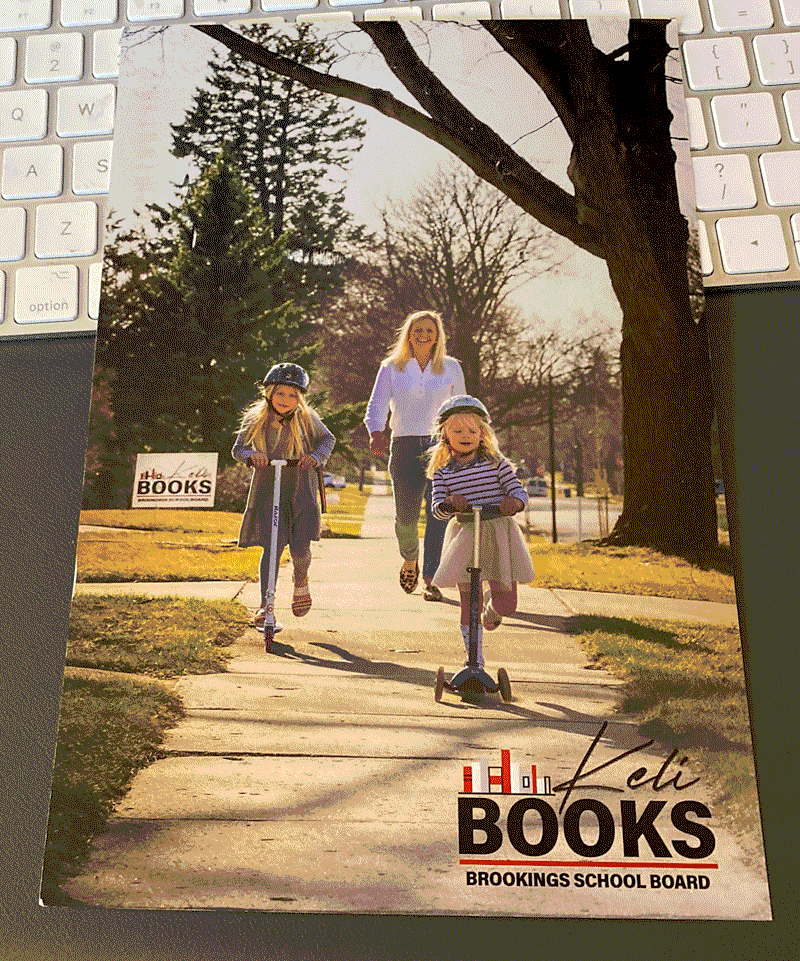
I get the impression that whoever did this card doesn’t do a lot of campaign advertising. In a campaign, you shouldn’t be designing a piece which mirrors an ad agency trying to establish good feelings about a well known brand. You’re trying to get a name stuck in the head of people that don’t know you when the person goes to the ballot box to vote. For a big 6″x9″ postcard, the absolutely most important thing on the front of the card is approximately 1 1/2 by 2 inches of all the space on the front, superimposed in a corner on top of what I would term a “vanity shot,” something that the candidate or someone speaking in their ear thought would look nice… but really, it doesn’t communicate much.
Yes, it’s a nice picture on the front. But the primary purpose of any campaign advertising is to communicate Name and Office. The logo could have easily been – and should have been – at least 5 1/2 inches across the bottom. Chop off some empty space in the photo in the form of tree branches and empty sidewalk, move the photo up, and make the logo larger, and it goes from wasted opportunity to doing what a campaign postcard is intended to do.
I’ll be the first to say that the other side of the card was very nice. But this front is a lot of wasted opportunity.
Next up, we have a candidate for mayor going for a “prince of darkness” vibe.
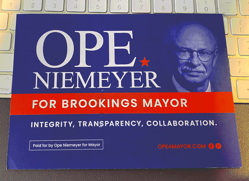
GAAAH! Satan is emerging from the depth of the shadows to run for mayor! I’ve noticed this same logo image in Ope Niemeyer’s campaign via facebook, and I can only wonder who on earth thought this was a good idea? I mean, did someone go to the designer, and say make the candidate appear darker and emerging from shadow in his advertising?
The only thing that it reminds me of is Max Von Sydow playing chess with death in The Seventh Seal.

It’s a very arty look for Max Von Sydow in the movie, but it’s an awful concept for a candidate. And even worse, that’s the only picture of him on the whole piece. On the back, the candidate talks a word soup about some issues, which doesn’t make up for the fact that from one look at that photo showing the candidate in the shadows, that he might possibly coming to steal our souls.
As I get to the end of my rant, it dawns on me why this photo is so wrong. The photo – monochrome & showing the candidate in shadow – used by the candidate actually appears to be in a style that an opponent would use if they put out a negative ad against him. So why on earth would the candidate use that for himself?
Candidates should use a nice clear photo, with open eyes, as their primary campaign photo if they’re trying to make a good connection with the people they send it to. Campaigns are about communication and marketing yourself. Positively.
Unless, the candidate actually has designs on where our spirits spend the afterlife.
I guess we’ll find out after the vote tomorrow.
I wold be okay with the first one, IF it was part of a larger campaign, like some videos, and this is a frame capture from that video or at least some additional campaign pieces As a stand alone campaign piece, The logo should be much much bigger.
The second one is kind of scary. Brighter colors would help, unless he wants to plunge Brookings into the dark ages
Trust me, he does. The current Mayor and City Manager have stated in public that they are going to reinstate all of the restrictions on businesses in Brookings at the City Council meeting next week.