
So my Facebook feed has been filled lately with images of the School Board race out in the State’s second largest community. And I just can’t help it, but there’s things that I see in this race that just kind of bug me from a campaign point of view.
First off, candidate Natalie Slack. Did no one bother to tell her that she really, really needed to take an honest look at her social media before she ran? The only thing that’s to her advantage is that there’s plenty that’s too profane for her opponents to use in print. Case in point:

And if she’s not leaning towards the profane, she’s doing her best on-line to tell Rapid City Voters that she is a lot more liberal than they are in fairly conservative Rapid City.

I think I’d archived the post I originally did several years back on the topic telling candidates to “police your social media” before you announce as a candidate, but for crying out loud, it seems like she’s done the opposite. It’s as if she’s actively taken a stand to defund the policing of her social media.
I can’t help but think there are a number of parents who just aren’t cool with a school board member declaring what she did about removing a rib and the acts 2019 could commit after that. And never mind wanting “someone who has done drugs and been in therapy” for President.
To sum it up, I think it could have a negative effect on her campaign.
On the more conservative side of the aisle, there’s some weird things going on with candidate logos.

Why did Deb Baker ruin the instant readability of her logo by doing that weird “half-B” thing with the first letter of her last name? Honestly, it was pretty good until someone made that mistake. I can’t repeat it often enough – In political campaigns, don’t mess with changing letters into weird design elements. It makes them hard to read as you’re driving by.
In campaigns, you’re trying to drill down a message in a matter of days or weeks. Don’t make that task more difficult by making it tougher to read when you drive by the darn sign.
Then we have what’s going on for RC School Board candidate Breanna Funke:

What’s with that weird glyph in the middle of everything? It reminded me of the logo for recording something on my iPhone in iPhone message, but that’s not it. Maybe it’s just bugging me because I don’t see the purpose.
In chasing it down, it’s otherwise known as “Sound Of Waves Line Logo Template Illustration Design” from CanStockPhoto.
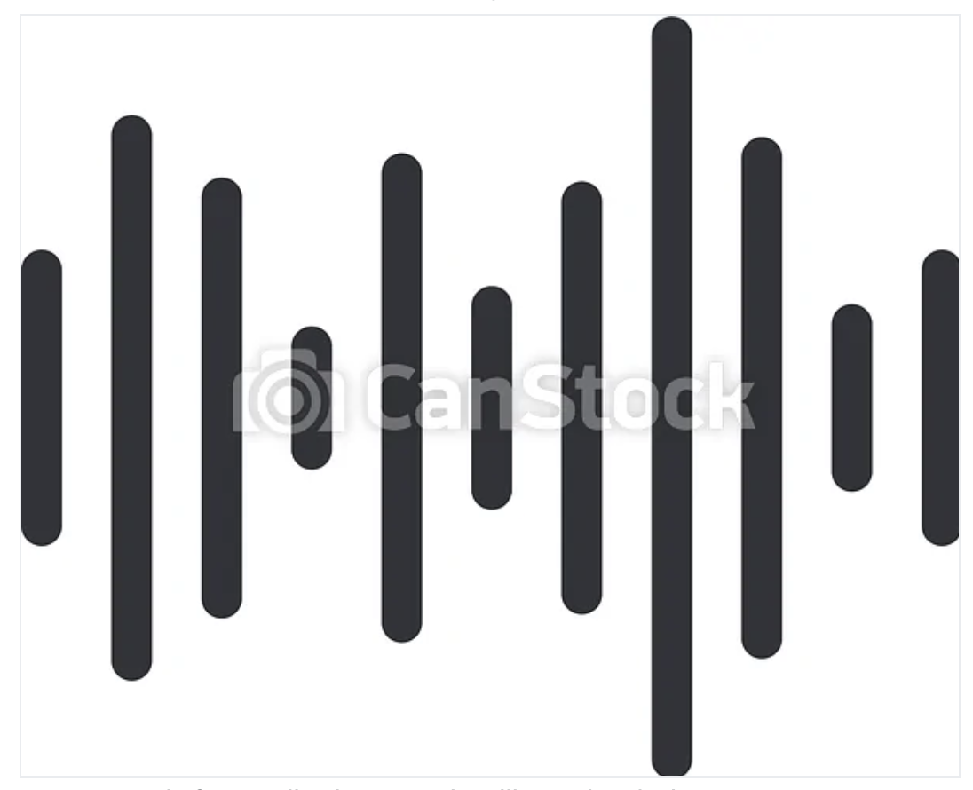
So, it’s a stock photo of sound waves someone bought off a website? Now it makes even less sense. To my knowledge, she isn’t a well known sound engineer or DJ. Which begs the question, why?
It looks like it’s some random graphic that was dropped in there because the designer simply wanted to make it look like they gave more than 5 minutes to the design. I’m not sure how it contributes to the design, except to take up space that where they could have made the name bigger.
I’m not sure how they could have made it worse. Oh wait – Here’s the yard sign:
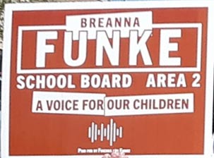
By adding a slogan to the mish-mash, they managed to make the name smaller by taking up 1/4 of the sign with the graphic they bought off the stock graphic website. And then jammed it all together so no one can read it as they drive by.
Who does this? Because as one of your more expensive items in a campaign, it’s not something that you want to goof up.
The other candidates have logos/signs which could be better, but these stood out. So take a look, and try not to make the same mistakes yourself.
Stay tuned.
This is amazing .. I thought I had sharp elbows. I want this woman on my show. You know our conversation would be delightful if she didn’t bail-out after seeing my Trump hat.
Wow, it looks like Slack shouldn’t be running her own life let alone giving input on how to educate children! Does she even have kids? If so, I feel sorry for them as she embodies the worst of the worst. Oh, wait, she probably aborted any kids she would have had by now.
The alternative candidate to Slack is an anti-vaxxer, anti-masker during the pandemic, is against fluoride in city water, loves conspiracy theories and has a weird fixation with kids genitals? Knowing the magnetic pull that attracts a high concentration of goofballs from across the country to the Black Hills and Rapid City.
Wow – you are creative at making up crap…just sayin’