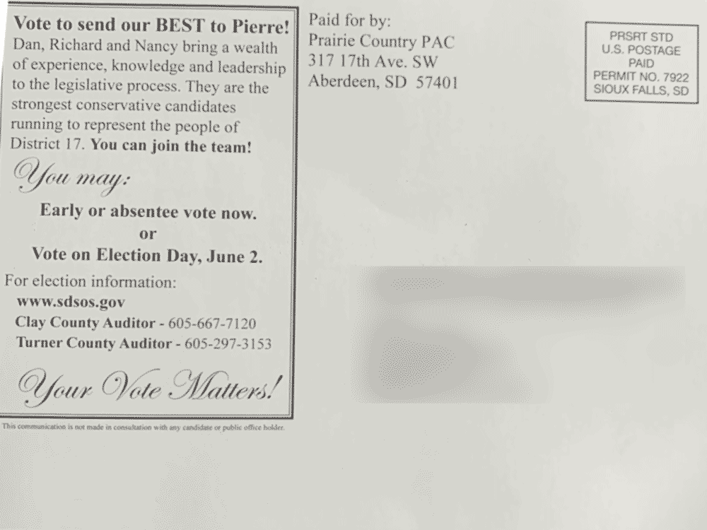
From today’s mail comes outside help for three of the candidates running in District 17 via the Prairie Country PAC out of Aberdeen:


Nothing against the people the postcard is featuring, but you’d better be pretty good at Microsoft Word if you’re going to use it in graphic design. Whoever designed this card wasn’t, and ended up with a bit of a mess. Aside from the fact it’s not very visually pleasing, they screwed up Nancy Rasmussen’s internet link, leaving it unclear what a reader should put in. Capitalization and punctuation are all over the place. And don’t get me started on spacing & margins.
If their goal was to move the candidates forward as a slate, I’m not sure it accomplishes that, as their names are some of the smallest text on the front. I mean, what are you trying to sell? UNDER GOD and LIBERTY or the candidates?
Your thoughts?

I look forward to information from South Dakota War College. The reason i like your blog is that It is honest and gives the good – bad – and the ugly! I am a Nancy Rasmussen supporter!
My thoughts? The SouthDacola guy wouldn’t be able to spot a single mistake.
I have zero problems with the candidates also, but my 9 year old could have done a better job on the ipad. Wow!
How many different fonts did they use? On the back where they use the cursive font?-hideous. And then alternating regular and bold type throughout-not a fan.
Not liking this mailer.