
Is there something weird going on with the Secretary of State’s website?
Over the past week or so, the menus on the front have become unlinked from directly clicking into sub-pages, with graphic images of text replacing the links.
And speaking of text, most of the site has become a mish-mash of web-font barf, like someone bought a font pack off of the internet, and is committed to using every single one. There’s no real consistency, and some weird decisions, such as capitalizing “DIVISION OF” but leaving “business services” in lower case as the title card in a section of the page.

Not to mention using fonts which might be great in black and white or other high contrast environment, but I know I’m challenged to read a white font on a white and grey herringbone pattern which quickly whizzes by. It’s getting to be as if the website is being updated by a high school student who has been given web access.
I think the Secretary of State would not find a lot of opposition if they broke down and hired a firm to update the website design which was was unveiled in mid 2014, and will celebrate it’s 10 year anniversary in 2024.

Here’s a snapshot from the wayback machine in 2014, shortly after it was rolled out under Secretary Gant, looking fresh and new. It was great for the time. Emphasis on “for the time.” And here’s how it appears today:
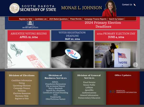
10 years and Three Secretaries of State later, (Krebs, Barnett, and now Monae Johnson) it has had the person in the masthead replaced a few times, menu items added, and especially of late is ever-increasingly band-aided. But it’s still the same website, looking scabbier every day as they try add things to menus, using inconsistent fonts and colors, and now it’s actually getting challenging to read.
Good gosh Secretary Johnson, go put out an RFP and let a web design firm give it a makeover. Your constituents will thank you for it.
There’s a marketing firm in Ohio that would love to swoop in and grab that RFP.
It’s an awful website — it’s near impossible to find anything. Application approvals are slower than they’ve been in a decade. They don’t even have the Vote 605 app anymore. The office is actually regressing!
I miss Steve Barnett at the helm.
I think the SOS wants to go back to a paper website and use no technology–like she does with tabulating votes.