
Just saw this on facebook for District 6 GOP House Candidate Aaron Alyward because it holds a few lessons that are good to point out for candidates on what to think about in your campaign pieces, and as you’ll see here, what not to do:
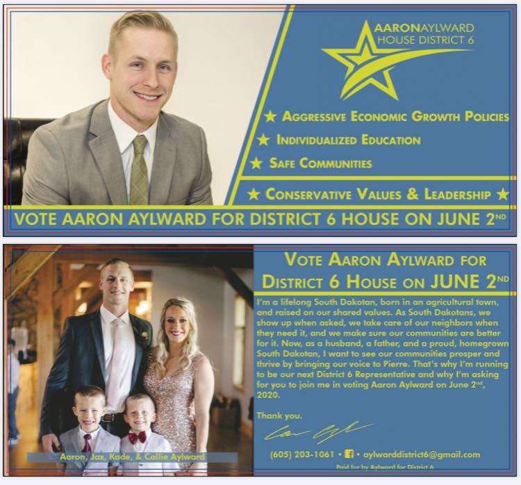
I like Aylward’s picture on the back, as it is a good, professional quality photo. Big point I try to tell candidates; good photos provide professional quality results. I would have removed the chair from the picture on the front and used a complete cut out as an alternative, as it would have provided more room, or at least more white space for the text.
And then we get to the problems with the card… And there are several.
First and foremost, what is that god awful logo? It’s not just bad, but it’s really bad. His candidacy is what he’s supposed to be selling. Not a giant star. It serves no purpose for a graphic element to dominate to that extreme degree.. in fact, it works against the candidate. (State Rep. Caleb Weis’ logo makes this same mistake.) What candidates need to highlight are name and office. Why would he muddle the main point by trying to brand himself with some generic piece of clip art?
Two of the front bullet points are problematic as well. “Aggressive Economic Growth Policies?” Does anyone use that in normal conversation? Is he going to stab someone when advocating for lower taxes or something? “Individualized Education?” What on earth is that? This comes off as inauthentic gobbledygook.
The message on the back of the card is very hard to read, especially with the yellow on light blue providing a low contrast. Not everyone is reading with the eyesight of a 20 year old. Everything seems jammed in there with little margin on the sides, and the text block is badly in need of a paragraph break. Not to mention the message shifts from the first person perspective to the third person before being signed in the first person.
And with it being a piece expressly geared to the June 2nd primary, why wouldn’t he note which party he’s actually running for? We don’t know if he’s running as a Democrat, Libertarian or Republican.
While the photo on the back is nice, this is otherwise one to send back to the designer, and they should be told to start again from scratch.
Agree with PP that: “I like Aylward’s picture on the back, as it is a good, professional-quality photo. Big point I try to tell candidates; good photos provide professional quality results. I would have removed the chair from the picture on the front and used a complete cut out as an alternative, as it would have provided more room, or at least more white space for the text.”
Great photos are very important. Good job on that aspect.
Aaron will be a fresh of breath air in Pierre. Who cares what his party affiliation is. What matters is what he stands for. I do think he leans Libertarian which means he should be a shoe in. Don’t tread on me.
Party affiliation is everything my dear. I don’t like the colors either.
Party affiliation is not everything my dear……….What the candidate stands for on issues that matter to the people is everything. My favorite color for party is yellow.
In this day and age there is such a distinction between the two major parties that party affiliation is very important. The Democrat party has gone so far left that if a South Dakota rep claims they are moderate they should take a look at why they are associated with the Democrat party.
I cannot see a case where I would vote for a Democrat, and certainly not at the national level.
I’m not a fan of the yellow and washed-out blue colors chosen, but I can look past that.
The individualized education needs some ‘splainin. Does that mean he is for school choice? If so, say it loud and proud.
Apparently in SD the red team is pro common core. Who has a bill on school choice?
While I suspect (but don’t know) I might agree with him on the issues but the card is horrible.
Tries too hard by using dog whistles or trying to subtly disagree with is opponent, the card makes him come across as unauthentic.
I heard it once said “If you want a the best obituary, don’t write it yourself. Let your wife write it with suggestions from you.” I think it applies with campaign postcards.
What card is horrible Troy?
The card that is the subject of this thread. I’m not talking about the card on my windshield the other day telling me to call to extend my auto warranty.
Ok Troy, why do you think the card is horrible and unauthentic? Have you ever met him?
Tara,
I’ve never met him. He may be the most authentic human being who has ever lived. The first impression I got when I read the card is it projects “phony.” I don’t think he intended to make phony his first impression. Thus, the card is horrible.
P.S. The pictures are fine. He has a wife and two kids. Idyllic and blessed. Great. Like Pat said, do it professional. Like every other politicians. It stands out only if your family pic looks like the Addams Family (or the Ozbournes).
Maybe cut out the person in the background on the backside.
The picture on the front appears to be the same one he used when running as a Libertarian candidate last election.
He ran as a Libertarian? Where do we find out the results…how much did he get? Thank you
https://ballotpedia.org/Aaron_Aylward
Who cares Pat. This isn’t a beauty contest, but if it was Aaron would win. lol. He will win on the issues because people connect with him. He’s an Independent thinker and a conservative that is for smaller government.
Why don’t the Libertarians just focus on building up their own party rather than run as Republicans? I’m glad a few BPOUs got rid of them.
Tara just hung the death kiss of Hubbleness on the poor guy using the same “free thinker” moniker she’s used to explain away nanobots and other Laura delusions. With support like that, who needs an opponent?
With an anonymous comment like yours that won’t even state their name, who needs a trolling coward? By the way you can’t even quote me correctly. Free thinker????? Better go back and correct your statement.